

Photo by AbsolutVision on Unsplash
Web Accessibility
The Web is born with accessibility in the first place


Frontend development at its core can be easy or too overcomplicated. Because there are so many ways of doing things and so much exploration and evolution happening at the same time. Accessibility is the core promise of the web and developers should know it by ❤️
Why accessibility goes wrong
Let's take this example

<div>
  <h1> Host Capacity </h1>
  <img src="something.png" alt="something" >
  <p>Used for SDDC provision with different host types </p>
</div>
Later on, we decided that the card was clickable and when we clicked the card, it would open the pop-up
<div onclick="openModal()">
   ...
</div>
In this scenario, why don't we use it as a button to begin with?
It doesn't look like a button
The button requires CSS reset
We don't think that button can contain an image
Accessible design
Accessibility starts with design. We should keep a few things in mind when designing, including color contrast, color blindness and font size
Accessible color palette
WCAG recommends the color contrast with the following specifications:
Small text (23px or less): 4.5
Small bold text (17px or less): 4.5
Large text (24px or more): 3
Up to 8% of the male population is red-green colorblind. And red and green are the main colors that we often use in our designs. When creating a color palette, make sure we don't heavily rely on red and green colors to indicate the different states of anything

Accessible Typography
Designing accessibility typography can be successfully done by following a few basic principles
Large font sizes are preferred, and we have to check different font-size for the different screens ( on a mobile device, the font size is smaller than on a desktop device )
Avoid using complex fonts for anything but decoration
Keep length-line between 70 and 80 characters
Hiding and Showing to screen readers
Hiding text content from a visual browser and having a row of social media buttons instead of a row of text is more intuitive to our users


For assistance devices and SEO bots, it will have no idea what these buttons mean
<!-- Use css to hide the text from "sr-only" -->
<ul>
  <li>
    <a href="">
       <svg> ... </svg>
       <span class="sr-only">
           Follow us on Linked In
       </span>
    </a>
  </li>
  ...
</ul>
An example with CharkaUI library
function Example() {
  return (
    <Button>
      <VisuallyHidden>Checkmark</VisuallyHidden>
      <CheckIcon />
    </Button>
  )
}
Visually hidden content but visible to screen readers
Screen readers read out what's visible on the screen. If something is set to display: none; or otherwise hidden, screen readers will not read this content
/* A hack from bootstrap sr-only */
.sr-only {
  border: 0 !important;
  clip: rect(1px, 1px, 1px, 1px) !important; /* 1 */
  -webkit-clip-path: inset(50%) !important;
  clip-path: inset(50%) !important; /* 2 */
  height: 1px !important;
  margin: -1px !important;
  overflow: hidden !important;
  padding: 0 !important;
  position: absolute !important;
  width: 1px !important;
  white-space: nowrap !important; /* 3 */
}
Visually visible but hidden for screen readers
Pseudo's element for visual content
Animation's stuff with pseudo's element
https://codesandbox.io/p/sandbox/silly-wilson-kpfq7t?file=%2Findex.html&from-embed=
Focus management
What is a focus?
For some of the users, focus is sort of the primary means of reaching everything on the screen, for someone who has carpal tunnel syndrome and can't use a mouse, or for someone who uses a screen reader and predominantly uses a keyboard to move a mouse
Tab, Shift+ tab ( to mouse the focus backward )
Up and down keys to select different elements in the select option

Not all elements are focusable
Things like input, button, link, and select are focusable. We don't have to do any extra work to make sure that users can reach them with their keyboard. For elements that are not interactive ( div, h1, p1, image, etc ), there's no reason to put those into focus order
Escape hatch for non-interactive elements


Tab order(Focus)
Tab order is actually inferred by the DOM ordering of your markup. The way I write my HTML dictates the order in which things will be focusable
But this can be a problem since we can use CSS to change the visual of the web
Accessible, Rich Internet Applications
I've strongly encouraged you to use native elements whenever you can because it gives you focus, keyboard interaction and build-in semantics, essentially for free
For some reason, we have to create our own component

Screen readers will have no idea this DIV is a checkbox element (even though it's a checkbox visually) and besides that, the DIV doesn't have a checked state like the input checkbox has
<div class="checkbox" tabIndex="0" role="checkbox" aria-checked="true" >
 Receive promotional offers
</div>
DOM + ARIA = ACCESSIBLE TREE

Modify semantics
Toggle button
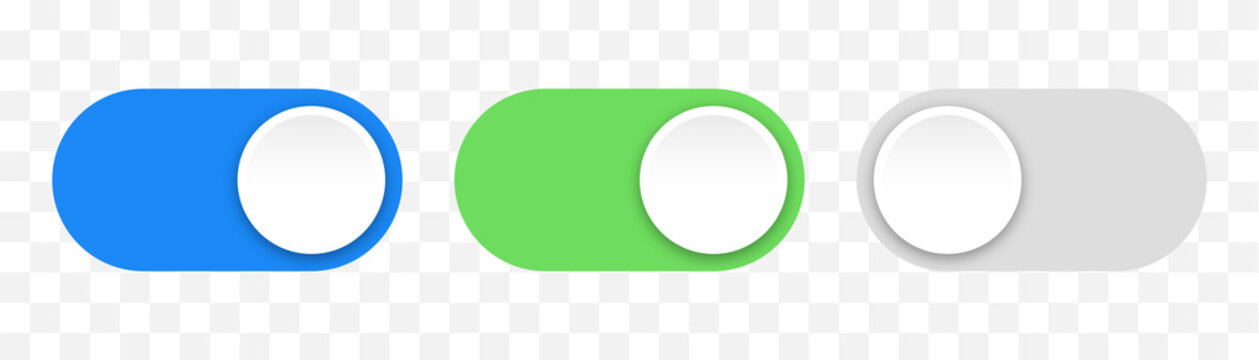
With the traditional HTML button, its semantic meaning is not clear to the screen reader or SEO bot. We need to communicate this is a special type of button (the button behaves like a checkbox)
<button role="switch"
        aria-checked="true"
        class="toggle"
/>
Create accessible component
ARIA expresses the semantic and UI patterns that don't exist in HTML
<ul role="tree">
  <li role="treeitem" aria-expanded="true">
     Accessibility
  <li>
  <ul role="group">
    <li role="treeitem" aria-expanded="false">
   </ul>
</ul>
Semantics and Interactivity
Element with Build-in purposes
<nav> is for navigation
<table> is for tables
<form> is for forms
<ul> and <ol> are for unordered and ordered lists
<select> is for selecting things
<input> is for inputting things
<button> is for buttons
<link> is for links
Buttons
Should you use a button, an anchor tag, or a div in HTML for clickable elements?
DIV
DIV is not accessible or focusable; screen readers will not recognize it and they do not translate certain keyboard inputs
With buttons, you can hit the tab key to make the button focus
focus state with button styling (tab)
If the button is in focus, you hit space or enter to trigger the button
<div
   role="button"
   tabindex="0"
   onClick=""
   onKeyDown="(e)=>e.key === 'Enter' || 'Space' { handle() }"
> Click me </div>
Button
The button is handled; all of it is out of the box
<button>
   I'm focusable , accessable , and keyboard inputable !
</button>

The challenge that I always get when using the button is that they have their own visual styling and it's hard to compromise or override it
/* buttons has their background-color , border , and their font */
button {
  padding:0;
  border:none;
  outline:none;
  font:inherit;
  color:inherit;
  background:none;
}

/* or reset it to a span , we need to do everything from scrach
styling , focus state , unfocus state , etc */
button {
 all:unset;
}

If the button is inside the form, it'll automatically be the submit type. In this situation, we have a form with two buttons (cancel) and (submit). We must declare the cancel button type="button"
<button type="button" onClick=""> Cancel </button>
Buttons behave like anchor tag
<button onClick="location.href="/"> Don't do this </button>
Not accessible with screen readers
Right-clicking doesn't work with buttons
Links
In most basic configurations, a link is an anchor tag with the href attribute
<a href="/about">About me </a>

<!--Download a file from the same domain -->
<a href="/excel" download >Download an excel file </a>

<!--Navigate users to different page , without anyway to get it back -->
<a href="https://myblog.com" target="_blank">Link to my blog </a>
The link also has other states and comes with its own configuration from the browser

Underline the state for clear communication
:hover,:focus,:active
link: This target has not been visited
visited: This target has been visited
<!-- you can wrap the link element in anything you want -->
<a>
 <img src="store.jpg" alt="Learn more about me" >
</a>
Screen reader with button and link
<a href="">
   Continue Reading <span class="sr-only"> vietnamese cuisine </span>
</a>
<button id="close-modal">
    <svg> ... </svg>
    <span class="sr-only"> Close order form modal </span>
</button>
Decorative elements

<ul>
<li> <a> Home </a> > </li>
...
</ul>
<!-- Better way is -->
<ul>
<li> <a> Home </a> <span aria-hidden="true" > > </span> </li>
..
</ul>
Use pseudo-element
li::after {
  content:url("...");
  height:24px;
  padding-left:6px;
  padding-right:6px;
}
Images, Graphics and Media
I have covered it here
Tips for aria-* attribute
As we already learned in one of my blogs,every DOM object (input,button,select,textarea) in JS is inherited from their upper-class

If you want to know what aria is available to us, we can access it through Element.prototype

Practical use-cases

With the button hamburger menu icon, we need to provide more information for accessibility

Multiple navigation menus
    <nav id="navigation" class="main-nav">

      <a href="#main" class="skip-link">Skip navigation</a>


      <ul>
        <li><a href="#">Home</a></li>
        <li class="has-sub-menu">
          <button class="menu-trigger">News</button>
          <ul class="sub-menu">
            <li><a href="/recent">Recent news</a></li>
            <li><a href="/local">Local news</a></li>
            <li><a href="/international">International news</a></li>
            <li><a href="/space">Space news</a></li>
            <li><a href="/good">Good news</a></li>
          </ul>
        </li>
        <li><a href="/about">About</a></li>
        <li class="has-sub-menu">
          <button class="menu-trigger">Another</button>
          <ul class="sub-menu">
            <li><a href="/recent">Something</a></li>
            <li><a href="/local">Else</a></li>
            <li><a href="/international">Entirely</a></li>
          </ul>
        </li>
        <li><a href="/contact">Contact</a></li>
      </ul>
    </nav>
Semantic HTML: buttons are designed for user interaction,
while links are intended for navigationButtons have better accessibility support for interactive elements that trigger actions or open menus
Preventing Default behaviors: When you use a <link>, clicking it typically navigates to a different page, so you have to preventDefault() but if you use the button, you don't have to care about it
A better-accessible navigation menu
Always add skip-to-content links
skip-to content is invisible until focus
Minimize tab stops (never expand on tab)

Basic card
A card is defined as a box with an image, text, and some links. But there's no card in HTML. So we have to define it by combining multiple HTML elements to make it work
   <ul class="card-list">
      <li class="card">
        <a href="#">
          <img src="images/cal.png" alt="" />
          <h2>First card<span class="sr-only"> continue reading</span></h2>
          <p aria-hidden="true">
            Once upon a time there was a card. The card had two friends.
          </p>
        </a>
      </li>
      ...
    </ul>

Because we wrap everything inside <a/>, when we tab to focus mode, everything will be in focus mode.

<ul class="card-list">
 <li class="card">
    <img src="images/cal.png" alt="" />
    <h2>
      <a> First Card </a> <sr-only> Read more </sr-only>
    </h2>
    <p>
       Once upon a time there was a card. The card had two friends.
    </p>
 </li>

So we can have a little CSS hack to make everything in the card clickable
/*Use pseudo-class a to cover entire card and redirect users to
different page */
.card a::after {
   position:absolute;
   top:0;
   left:0;
   content:"";
   display:block;
   width:100%;
   height:100%;
}
The drawback with this approach is that I can't highlight the text because the pseudo-element has covered the entire card
Note from charka UI
When you need to link an entire component or card, it can be tempting to wrap it within <a href="..."> and think you're done. This is considered unsemantic and incorrect because the component or card could contain other clickable elements or links (tags, timestamps, buttons).
<a> element’s content model specifically states that a <a>LinkOverlay from charka UI
LinkOverlay concept is that we have a link inside a parent element, and when we cursor over the parent element, we click. It'll navigate to the link inside the parent element

<LinkBox cursor="pointer">
        <Image
          src={thumbnail.src}
          alt={title}
          borderRadius="md"
          placeholder="blur"
          loading="lazy"
        />
        <Box display="flex" flexDirection="column" alignItems="center">
          <LinkOverlay href={href} target="_blank">
            <Text mt={2}>{title}</Text>
          </LinkOverlay>
          <Text fontSize={14}>{children}</Text>
        </Box>
</LinkBox>
When I tap on the link, I'll go straight to the anchor tag , and when I click on the entire card, it'll show me the cursor and when I click on the card, it'll direct me to a different page

Bad examples
I found an example that I've used in the past where I accidentally wrapped the button inside a link :)

The correct way to render it

Another misuse of button and links

Correct use

Summary
Working with accessibility can help simplify web development. Oftentimes, we should think of using the native elements provided by browsers to ensure accessibility. When building things with high-level architects like React and Angular, the concept is still the same; we make the component not only extendable and easy to use but also support accessibility